Case study 12 / 12
← All workType One
A conference about type, built from the tools type designers use.
01 The brief
A website for TYPE01’s first conference: two days of type in London.
TYPE01, the magazine for modern creatives, organises its first conference on typography in print, motion design and branding. Workshops on Friday, seven talks and a keynote by Tobias Frere-Jones on Saturday, a dinner and free online streaming. The brief: structure all of that into a clear, responsive website for desktop and phone, with a more typographic take on TYPE01’s identity.
Designed out of the artboard itself.
02 Research
Graphic design layouts, and TYPE01’s own voice.
I started by looking at contemporary graphic design and event layouts to see what felt interesting, and studied TYPE01’s visual language. I already knew the magazine well, so I could quickly see where the website could push further than the brand usually does.
03 Three directions
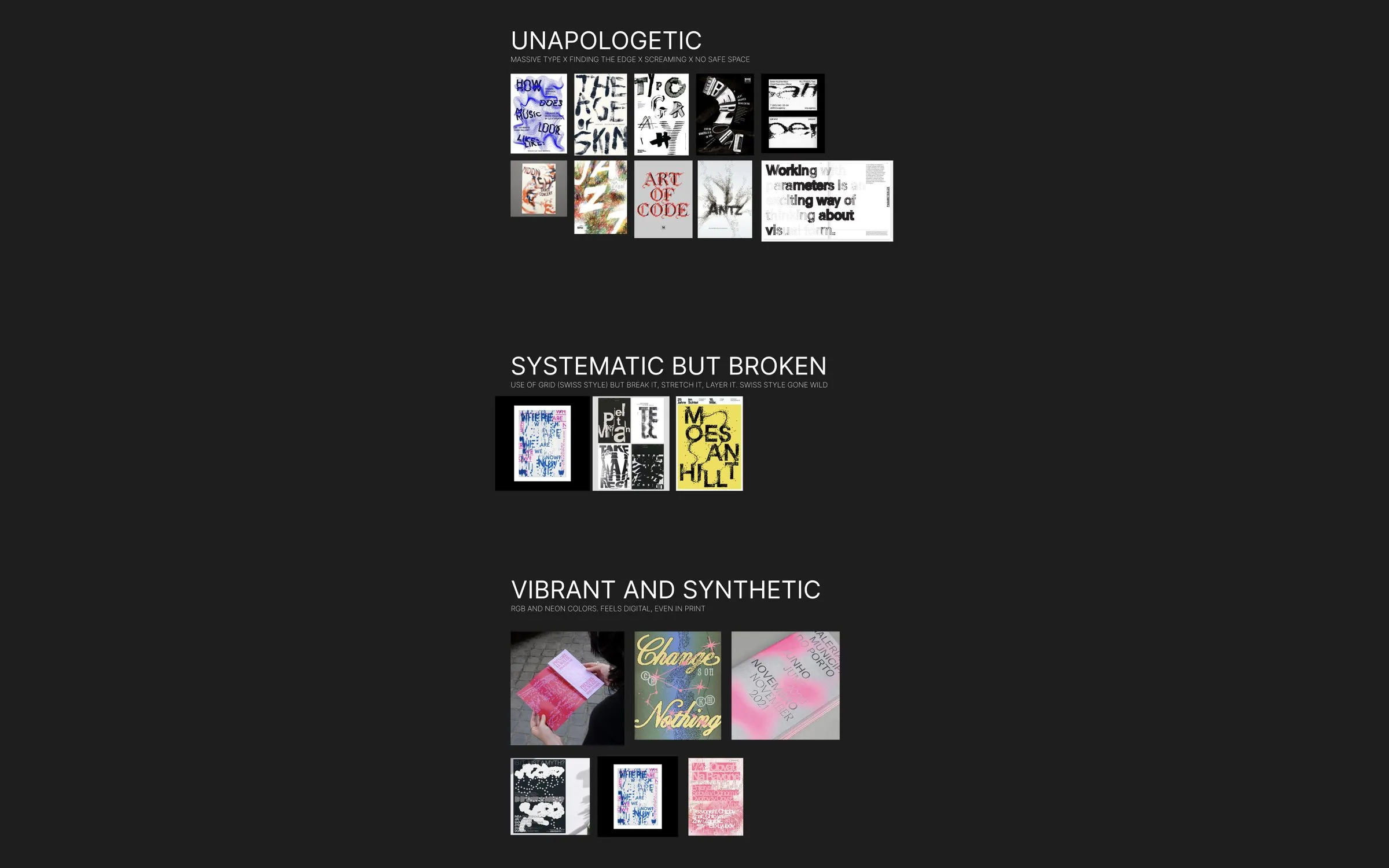
From a moodboard to a direction I liked, fast.
Unapologetic
Massive type, finding the edge, no safe space.
Systematic but broken
A Swiss grid, but stretched, layered and broken.
Vibrant and synthetic
RGB and neon colours: digital, even in print.
Where I landed
A broken artboard with massive script type: systematic, but with a voice.
04 Wireframes
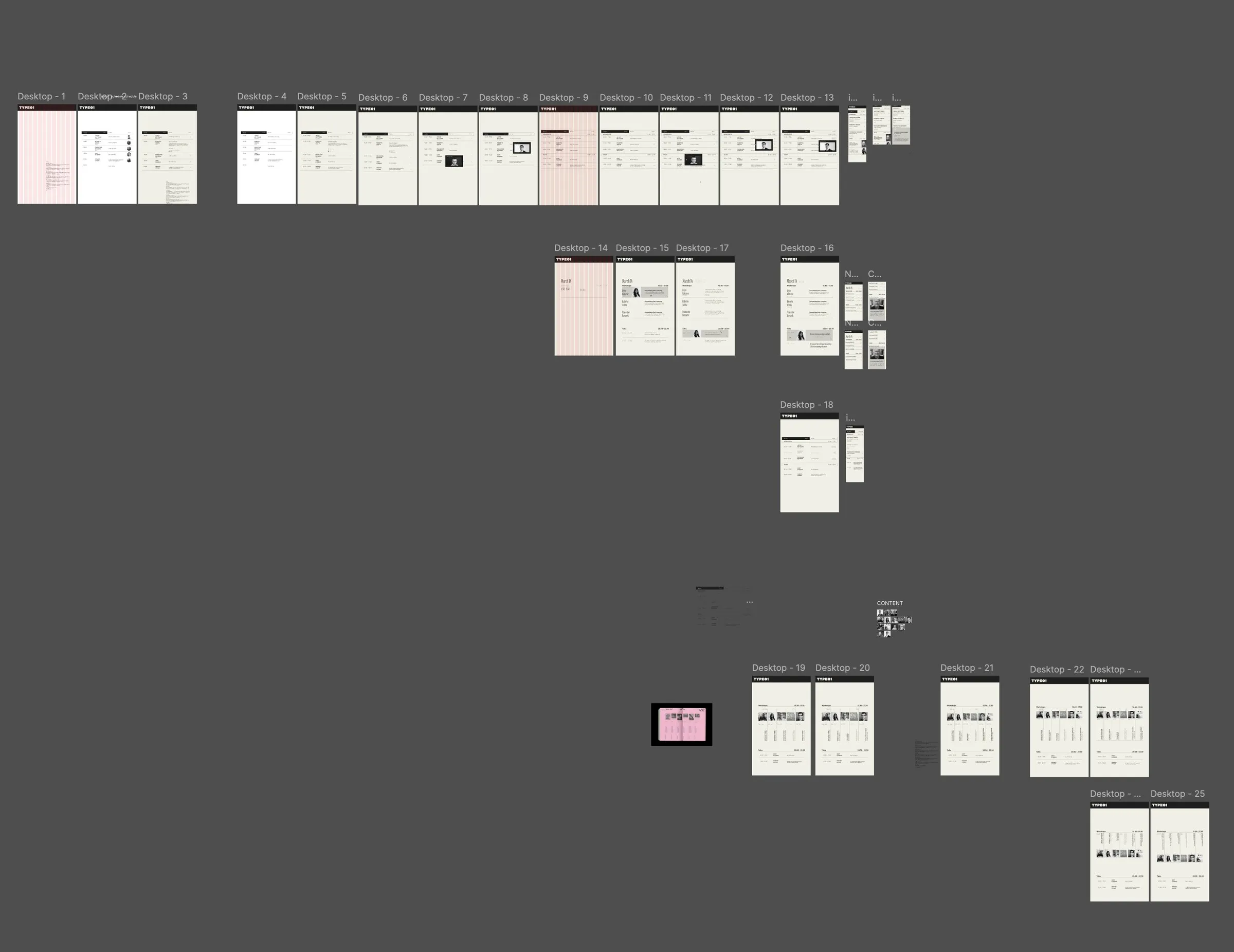
Lots of layouts before a single colour.
Content first
Mapping every section first: general, location, workshops, talks, tickets, footer.
25 wireframes
Desktop layout after layout, to find the order and rhythm of the page.
The schedule
Two days of workshops and talks, each with a time, speaker and studio, still readable.
Phone and states
A phone version, with workshop cards that open to show the details.
05 The concept
A conference for type designers, built from the tools they use every day.
The canvas grid
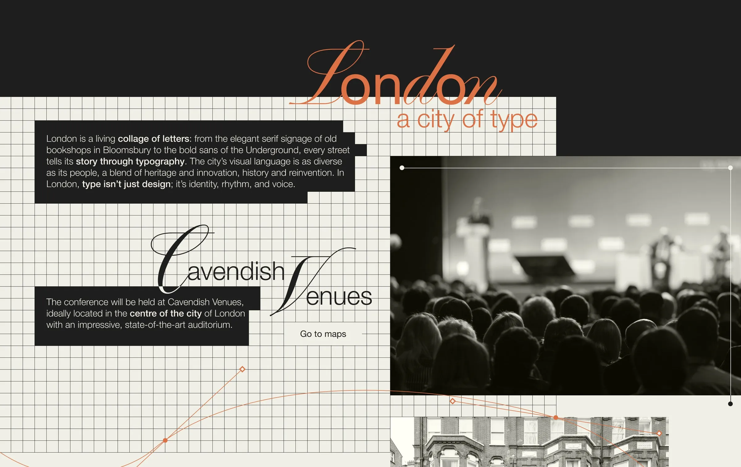
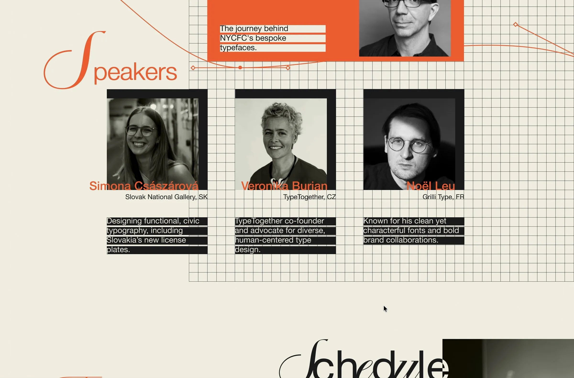
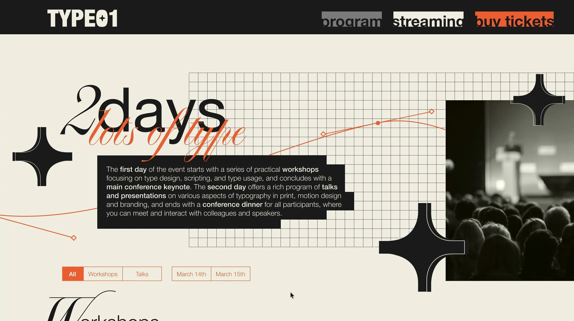
The background is the grid of the artboard itself.
Pen paths
Thin orange curves with anchor points and bezier handles run through the page.
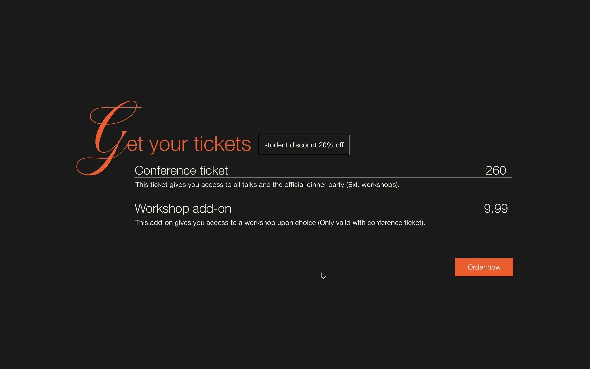
Script initials
Oversized script capitals as the handmade voice, set against a clean grotesk.
Stars
A bold four-point star as the recurring mark.
06 Colour and motion
From bold pink to orange, and transitions that feel smooth.
Pink first
In the beginning I was set on a bold pink accent.
Then orange
A teacher talked me out of it and suggested orange, to feel less feminine. It kept the boldness.
Smooth motion
Smooth animations in the prototype, from the fold to the opening cards.
Built to filter
Filters by day, format and topic make two days of programme easy to scan.
07 Outcome
Outcome
A full desktop and phone design for a two-day conference, from research and wireframes to a prototype with smooth motion. The tools of type design became the visual language of the site.