01
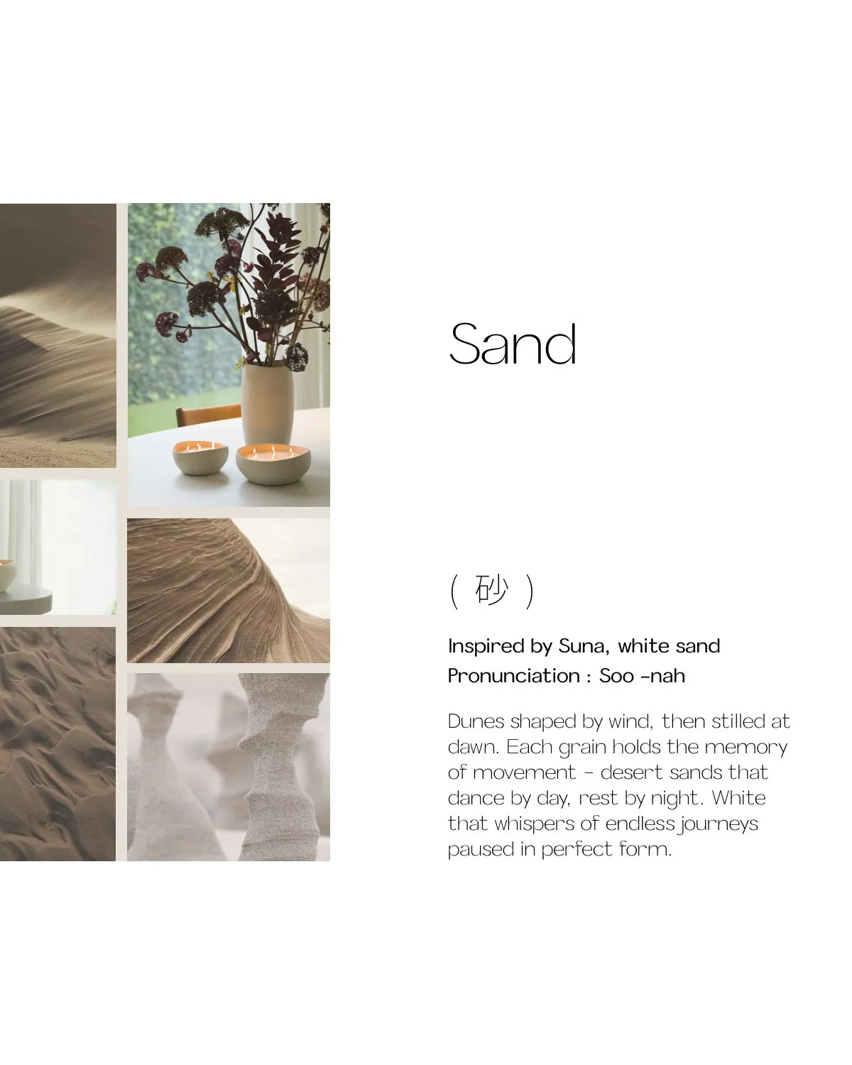
Suna 砂 · sand
Dunes shaped by wind, then stilled at dawn. White that holds the memory of movement.
Case study 04 / 07
← All workThe quiet revolution of imperfection.

01 The problem
In a world that demands flawless symmetry and instant gratification, Mon Dada wanted a collection that invites stillness and presence. The challenge: make imperfection feel like luxury, not like a mistake, and give it a story strong enough to carry product, packaging and launch.
02 The name
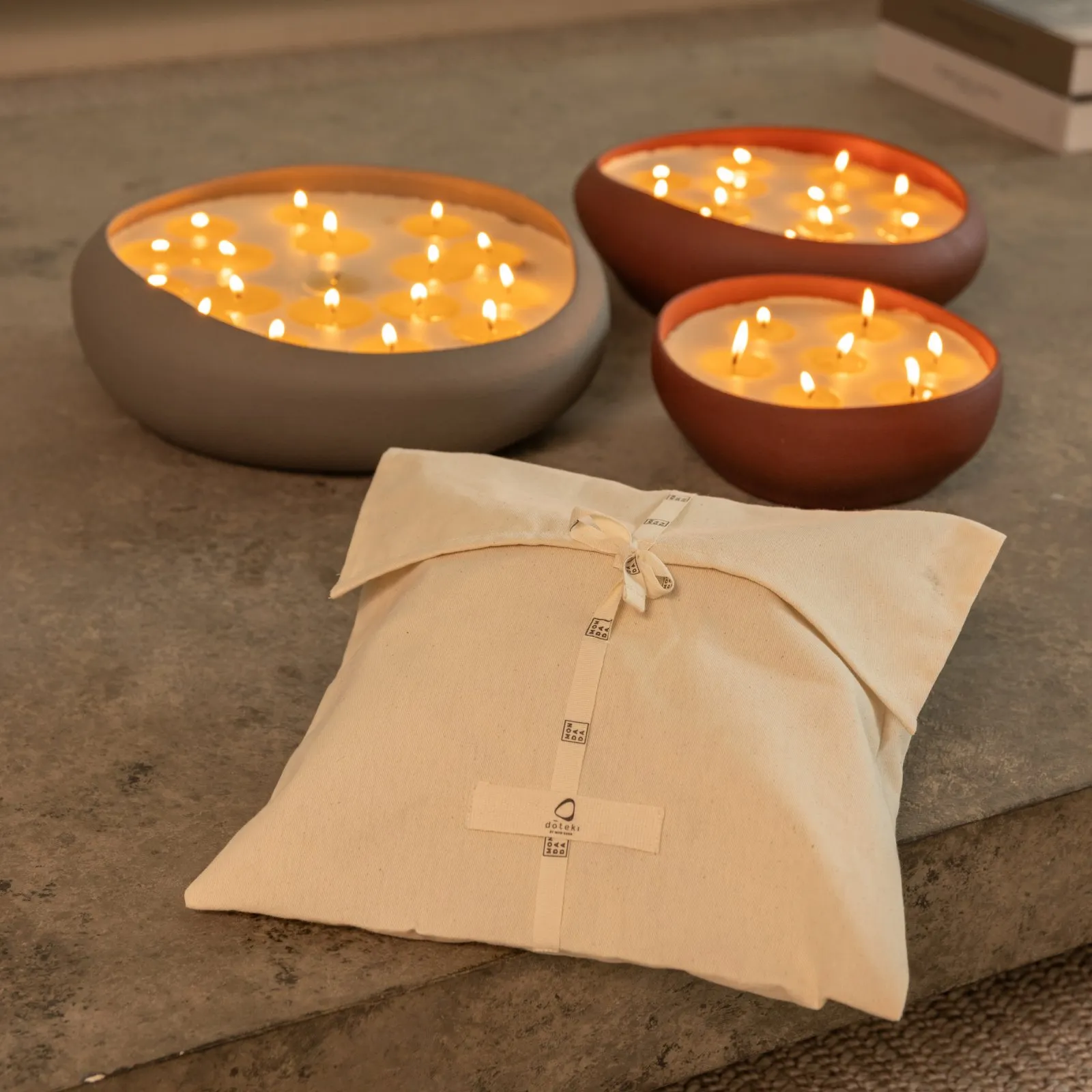
The collection captures forms shaped by natural forces in motion. Each candle holds the memory of movement, settling into a shape only nature could design. Inspired by wabi-sabi, flowing forms freeze into moments of quiet grace.
03 The thinking
Beauty in the unfinished, the asymmetrical, the naturally flawed.
A gentle rebellion against perfectionism and speed.
Finding peace within movement.
Colours borrowed from nature, not chosen from charts.
04 Colour stories
Dunes shaped by wind, then stilled at dawn. White that holds the memory of movement.
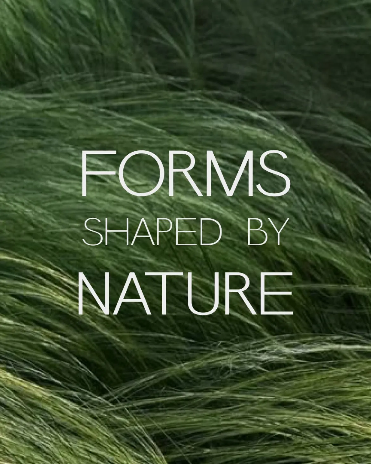
The visual language: natural movement caught in stillness.
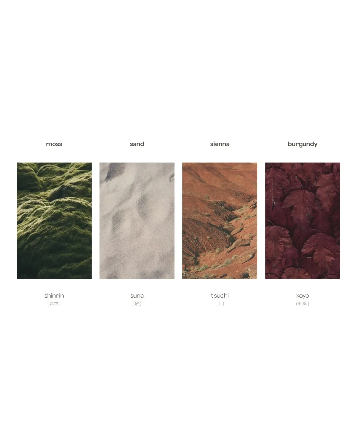
Moss, sand, sienna and burgundy: shinrin 森林, suna 砂, tsuchi 土 and koyo 紅葉.
05 Decisions
From a first set of names to four that tie each colour to nature in motion.
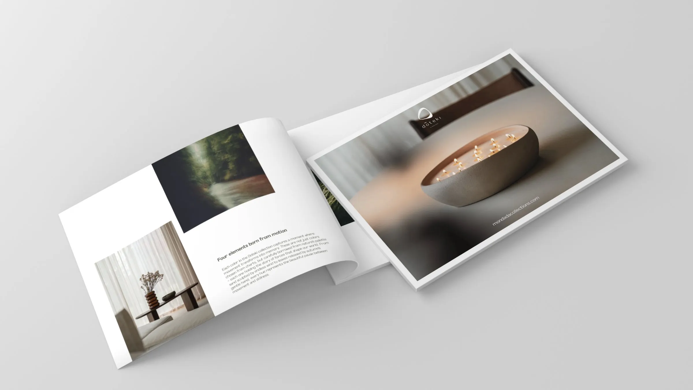
Low exposure to catch movement, soft diffused light, asymmetric compositions with negative space.
Yuzu and hinoki, a smoky heart of fig and patchouli, settling into sandalwood, amber and musk.
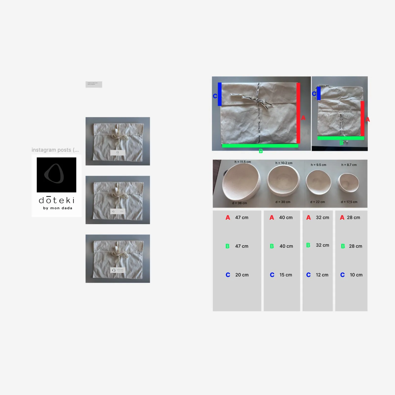
Linen gift bags sized to each of the four bowls, closed with a Mon Dada ribbon.
A spacious editorial system: atmosphere first, product index last.
Beauty lives in the unplanned.
06 Outcome
A deeper emotional story for the brand, a strong customer response around craft and mindful living, and the brand seen more as a luxury house with a philosophy.