01
Born from Glass
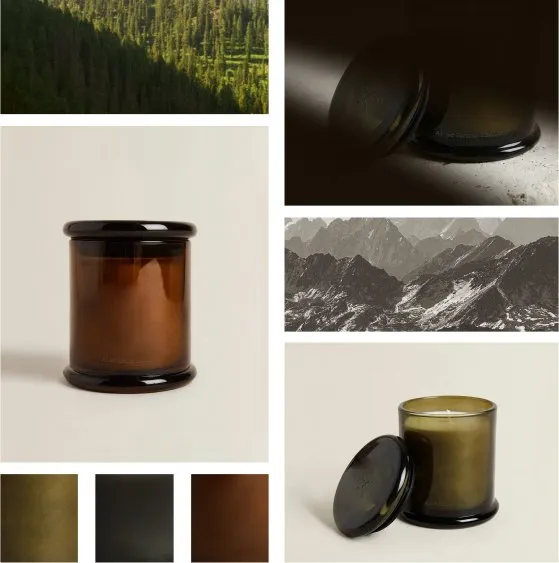
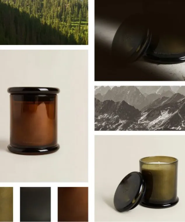
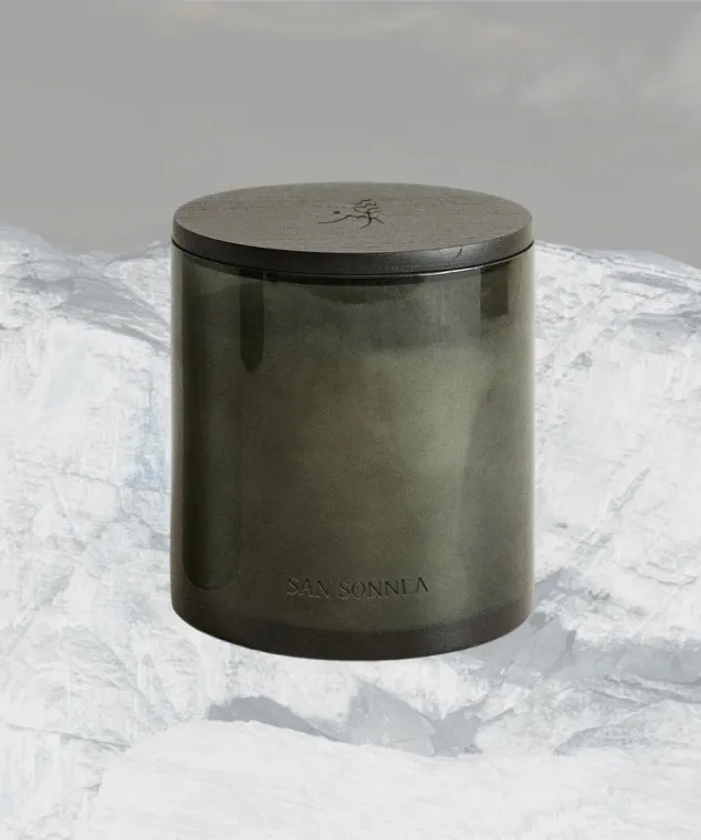
Deep-tinted glass, lit from within: the pine breeze, the dark mountain stone and golden hour at the lake. The mantra is sandblasted low into the surface, the mark engraved in the lid.
Case study 02 / 12
← Al mijn werkDeze case study is voorlopig alleen in het Engels.
A private label collection for a luxury resort in the Dolomites.
01 The brief
Through Mon Dada's private label, a luxury resort group in Northern Italy asked for its own home collection. Every one of its places lets the landscape speak first, so the object had to do the same.
02 Research
Philosophy, values and tone of voice: poetic yet grounded.
Landscape-first: natural light, raw texture, slow motion.
Five Alpine and lake resorts compared on positioning, strengths and gaps.
What competitors sell as home fragrance, and what they miss.
Key insight
Most resort fragrance looks like spa supplies: standard glass bottles and clinical diffusers. None of it feels like an object you'd want to keep.
Everything else stays at the retreat.
Except for memories.
A guest can't pack the mountain air, the stillness, the quiet of the room. Memories are the one part of the stay that travels. Scent has proven to bring back a memory faster than any photograph. A dedicated scent is the way to go.
03 Approach
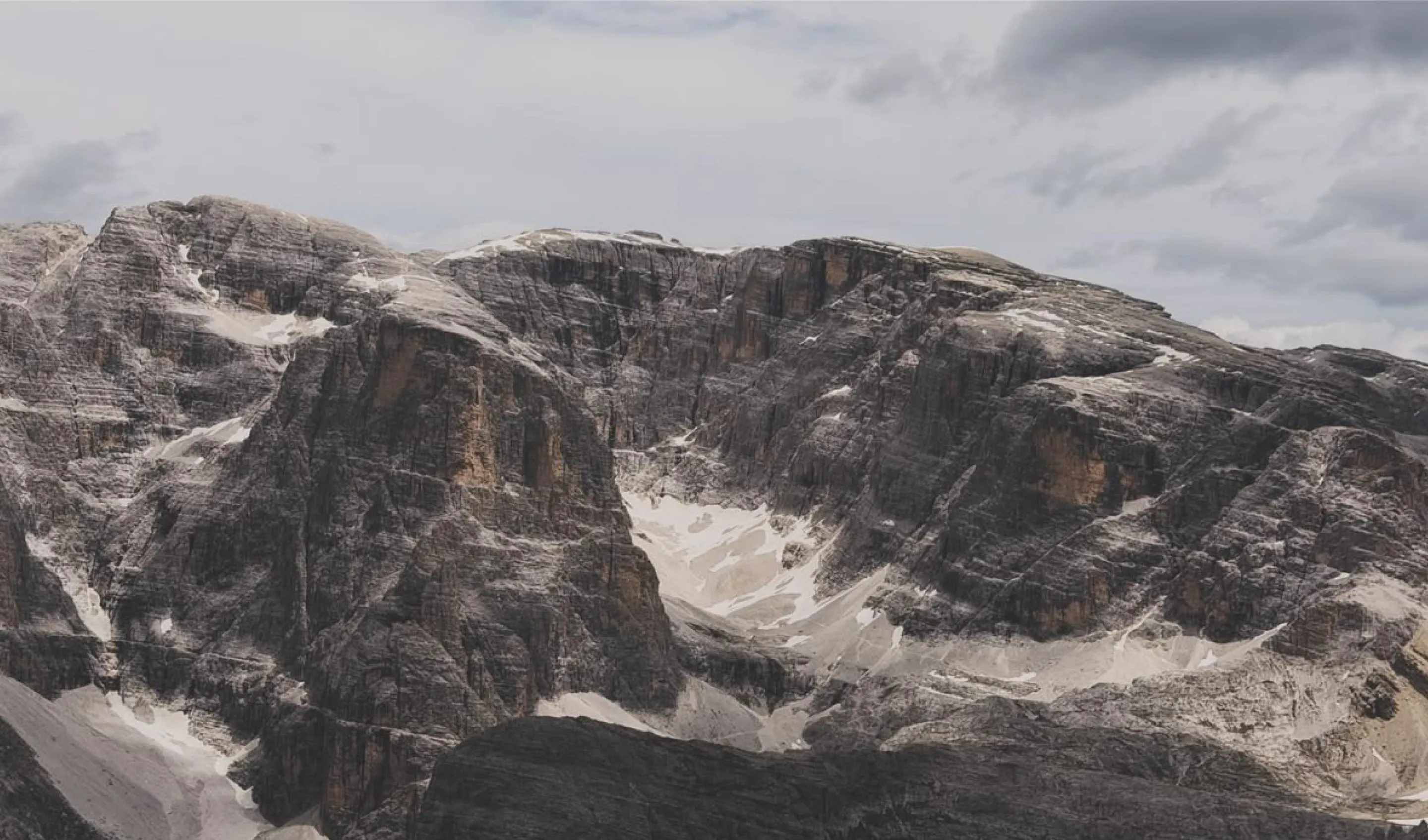
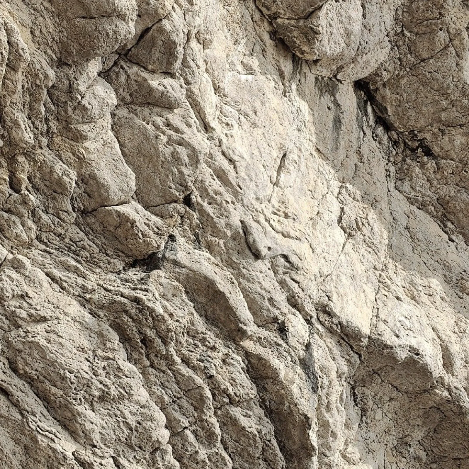
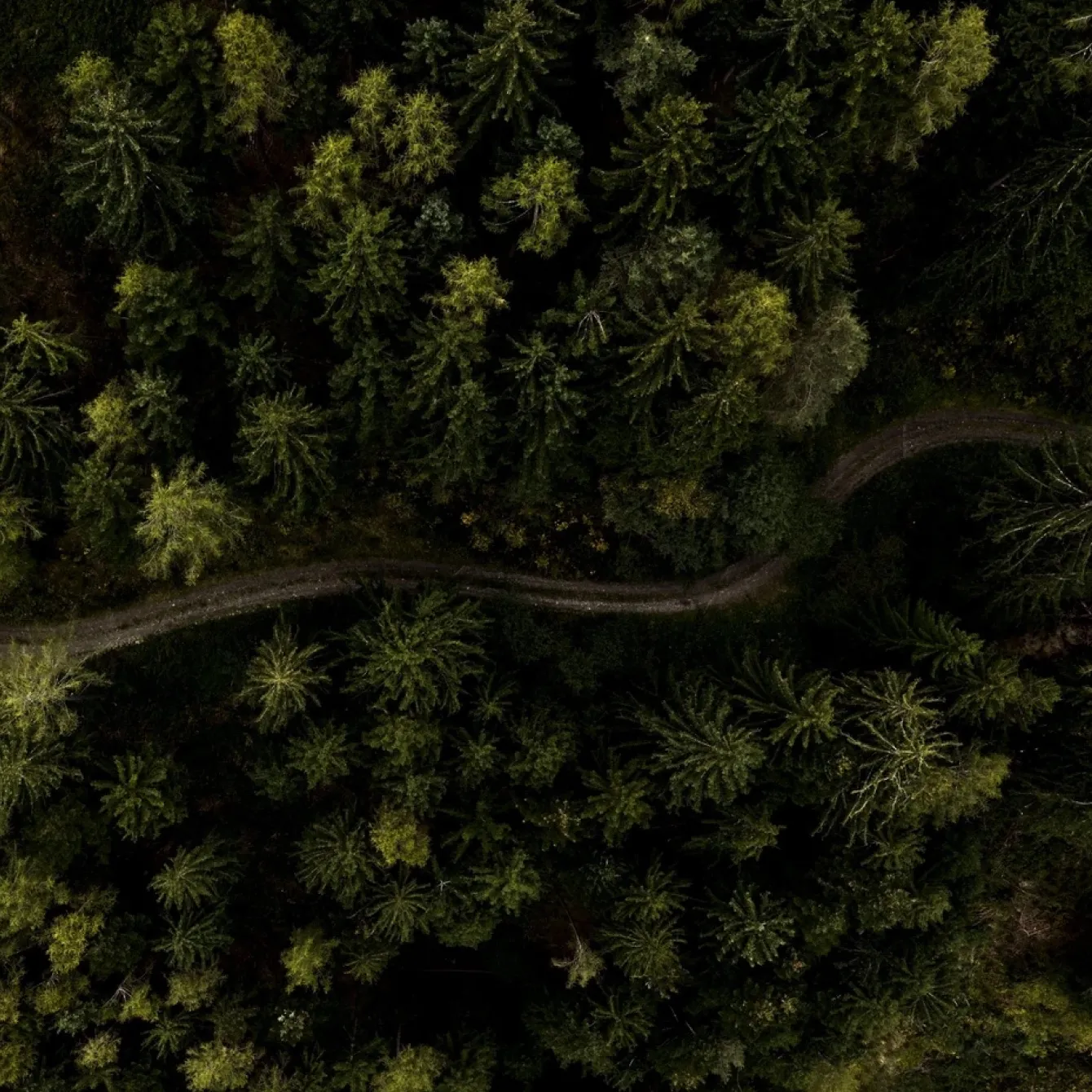
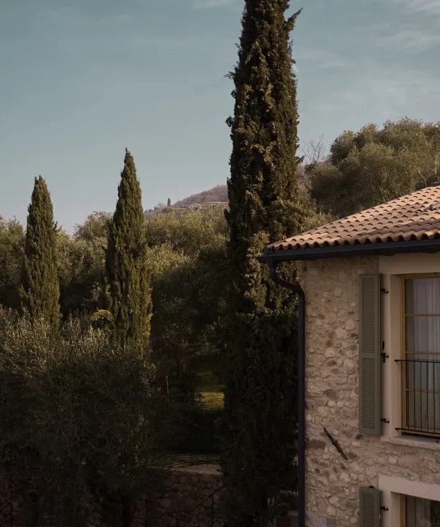
Rough limestone, weathered larch, clay and lake-worn stone. Every texture and tone is drawn from the ground the properties stand on: nothing invented, nothing added that isn't already there. Design principle: the room stays quiet, and the object doesn't ask to be noticed.
04 Process
First conversations and what the resort wanted.
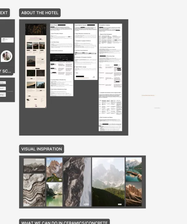
What are their mission and values? Understanding the competition and their merchandise.
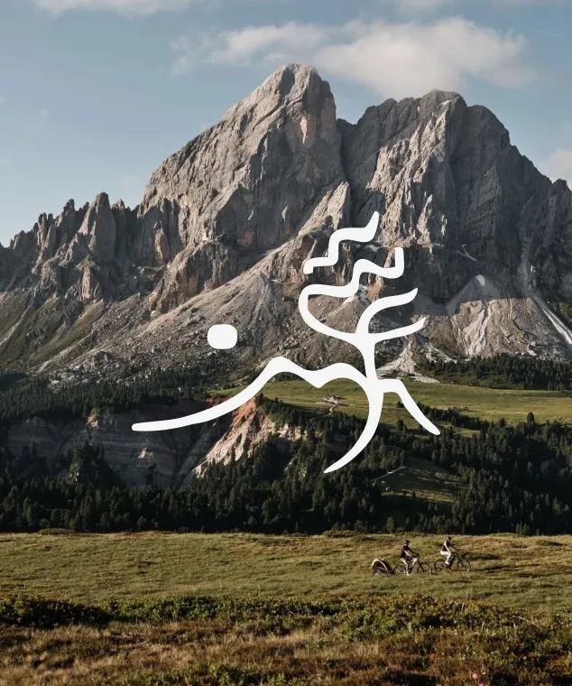
Tone, photography, typography.
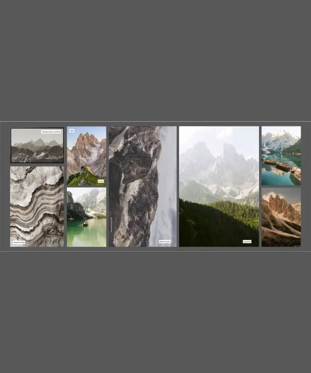
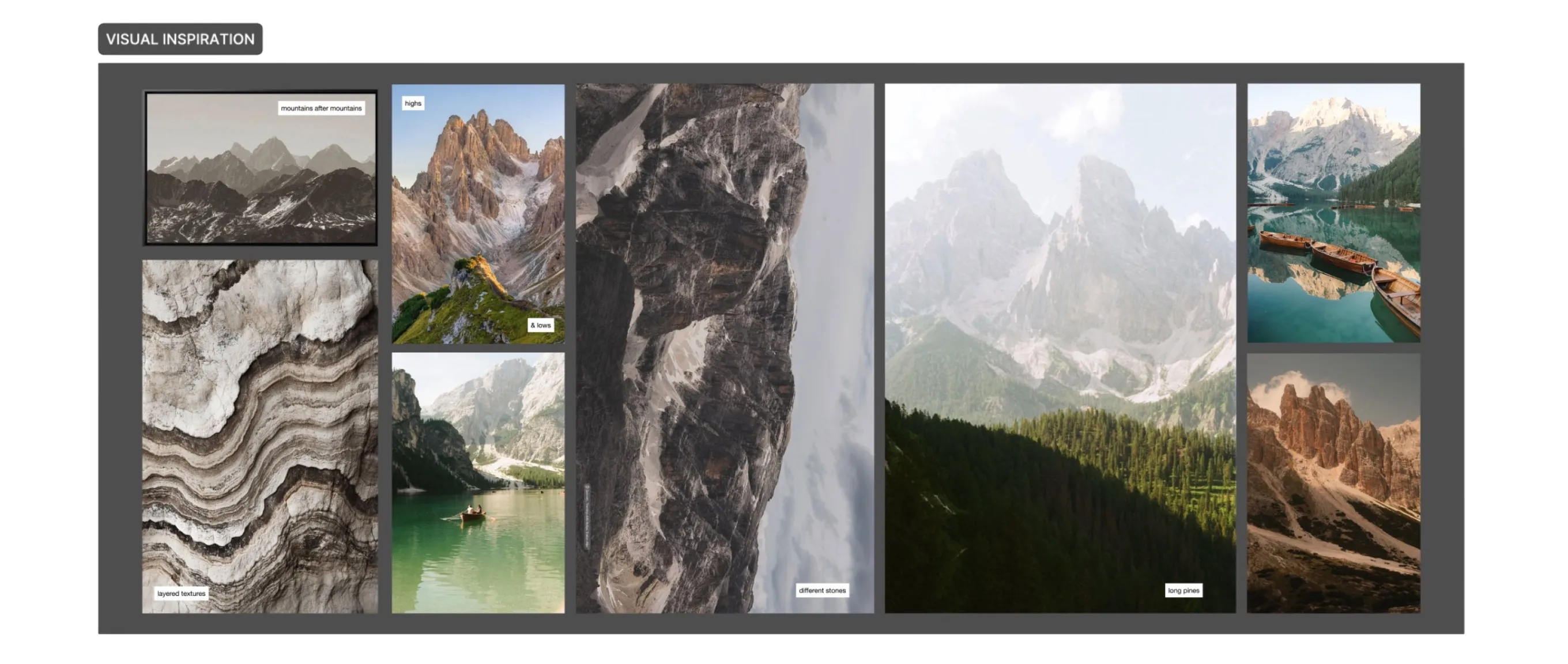
Layered textures, different stones, long pines.
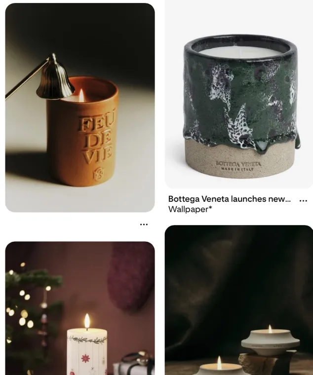
What's possible in ceramics, concrete and glass?
Vessel sketches and first mockups.
Why, approach, 3 vessels, 3 scents.
Positive feedback from the client. This project is currently further being worked out.
05 Three vessel directions
Deep-tinted glass, lit from within: the pine breeze, the dark mountain stone and golden hour at the lake. The mantra is sandblasted low into the surface, the mark engraved in the lid.
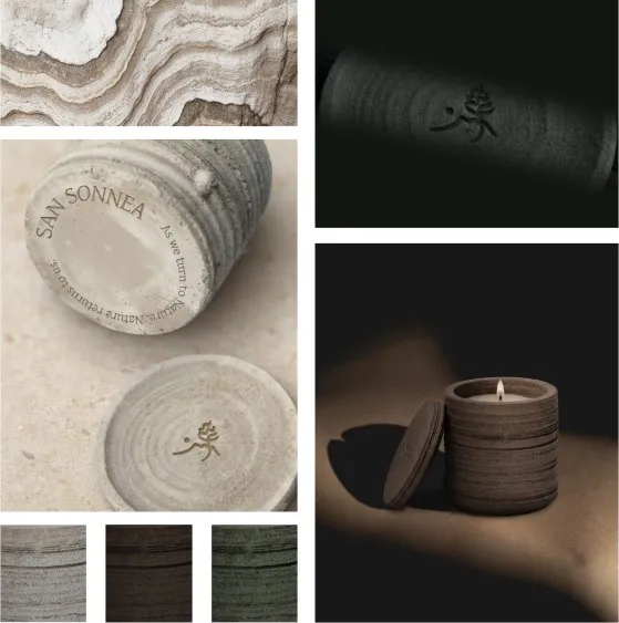
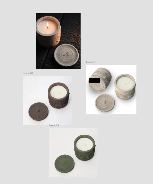
Layered like the mountains, reinterpreted in clay. Colour is the only variable: stone, fertile earth and pine green, without leaving the family silhouette.
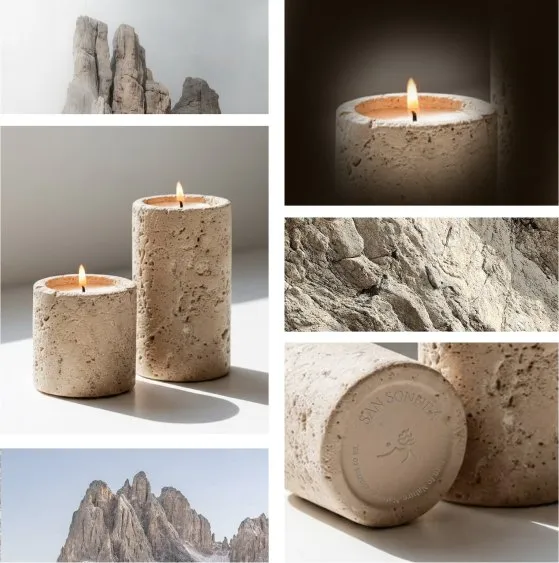
Hand-cast, ridged concrete with a texture that reads like rock. Its roughness meets the softness of candlelight; mantra and logo engraved underneath.
06 Where it stands
This project is currently being worked out further and the order has been placed. I'm still part of the process.